Digital before his time

by | Monday, August 11, 2008

A recent story in the NYTimes about Peter Gabriel (An Old Rocker Gets Digital) brought back memories of Peter Gabriel’s album covers. It tells you a lot about me that I know album covers better than I know his music!

During his time with Genesis and later, when he went solo, Peter Gabriel had some of the finest album art you can imagine. Quite a bit of his early album art was designed by the design group Hipgnosis, and as their wikipedia page says, “Hipgnosis’ approach to album design was strongly photography-oriented, and they pioneered the use of many innovative visual and packaging techniques. In particular, Thorgerson & Powell’s surreal, elaborately manipulated photos (utilizing darkroom tricks, airbrush retouching, and mechanical cut-and-paste techniques) were a film-based forerunner of what would, much later, be called photoshopping.” [You can see examples of their work at the Hipgnosis gallery. Maybe their most famous cover was the one they did for Pink Floyd’s Dark side of the moon.]

I remember reading that Gabriel was one of their favorite clients – mainly because they shared a certain aesthetic, which in some way was a nascent “digital” aesthetic – of bricolage and assemblage, a precursor to, what we would today call, the mashup. So in that sense the NYTimes title gets it wrong. This old rocker got digitality even before it existed as a term. So in some sense digitality is not as much about technology as it is a state of mind! [My earlier posting, life is about editing, speaks to this as well]

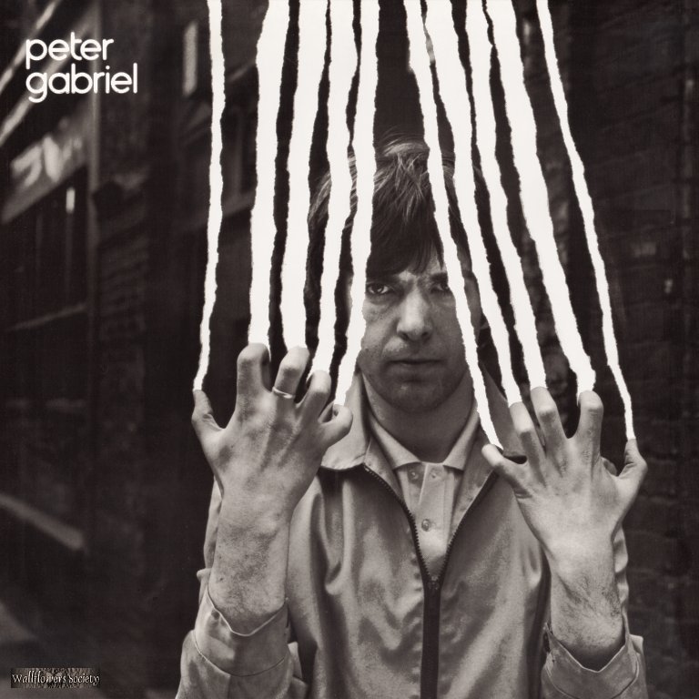
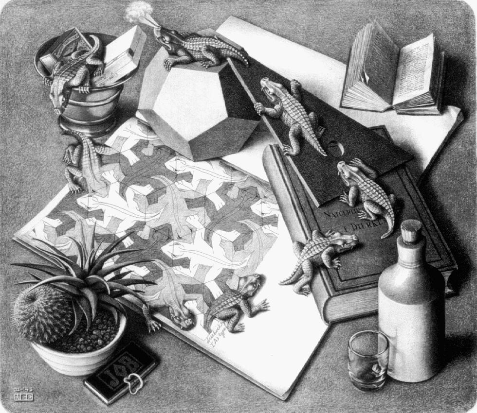
As an aside, here is one of my favorite covers designed by Hipgnosis for Peter Gabriel. It is a powerful visual image, reminiscent in some strange way with Escher’s experiments with dimensionality. Compare the two images below. Both represent an eternal and futile struggle by 2-D creations to break out of their flat world!!

A few randomly selected blog posts…

Today’s Internet cliché award goes to:

Sara Black, a professor of health studies at St. Joseph's University for the following insightful quote: "The Internet can be a great tool, like any tool, it can also be misused." Check it out on CNN.com in a story titled "#@*!!! Anonymous anger rampant on...

It Takes Two: A scientific romp using AI

It Takes Two: A scientific romp using AI

Dark 'n' Light is an e-zine that "explores science, nature, social justice and culture, through the arts and humanities." It is a labor of love by a small, dedicated team led by Susan Matthews, former legal and policy wonk, turned editor and podcaster. I came to know...

More sketches

A few weeks ago I had blogged about my experiments with sketching on a Wacom graphics tablet. Here are more sketches I have created in the meanwhile. You can see them here as a webpage or view it as a slide show.

TPACKed and ready to go

I am off to the Netherlands, specifically to Twente University to talk and discuss TPACK and other interesting stuff. I have been invited by Dr. Joke Voogt, Associate Professor at the Department of Curriculum Design and Educational Innovation from the Faculty of...

EDUsummIT 2019: eBook released

EDUsummIT 2019: eBook released

EduSummIT is a global community of policy-makers, researchers, and educators working together to move education into the digital age. EDUsummIT has been convening every two years since 2009. In each case the participants focus on some significant theme relevant to...

e. e. cummings on the battle for identity

Patrick Dickson just quoted e. e. cummings (one of my favorite poets) and I just had to look it up. To be nobody-but-yourself — in a world which is doing its best, night and day, to make you everybody else — means to fight the hardest battle which any human being can...

Death & Taxes

I am always on the lookout for new and interesting visual representations of complex data and just discovered Death & Taxes, 2009: "is a representational poster of the federal discretionary budget; the amount of money that is spent at the discretion of your elected...

(de)Signs, a series on Slate

Slate magazine is running an interesting series by Julia Turner on signs and their design. Two articles are now up The Secret Language of Signs: They're the most useful thing you pay no attention to. Start paying attention. Lost in Penn Station: Why are the signs at...

Seeing patterns with eyes closed

Oliver Sacks has a fascinating piece in today's NYTimes (titled Patterns, as a part of his NYTimes blog, Migranes, perspective on a headache). Oliver Sacks describes the visual auras he has suffered through his life as follows: tiny branching lines, like twigs, or...

1 Comment

  1. DIrkin

    I’ve always been a fan of Gabriel’s aesthetic. Search YouTube for his videos and you see how incredibly diverse his videos were when videos were still in their infancy. David Byrne from the Talking Heads is usually cited as a more innovative media artist, but I’d have to say Gabriel is far more inventive and cross media than Byrne has been. Even in live concerts, like the Secret World tour, Gabriel was using video, stage effects and props simultaneous to create a “mashup” of digital and practical effects long before it was the norm.

    http://www.youtube.com/results?search_query=peter+gabriel&search_type=&aq=f

    Reply

Submit a Comment

Your email address will not be published. Required fields are marked *